Haichang Ocean Park
New brand in development
SUMMARY
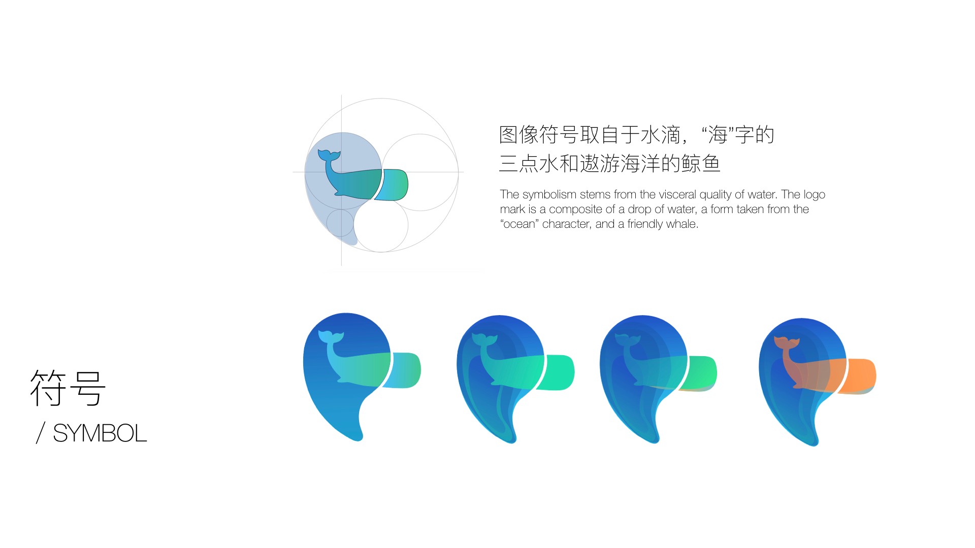
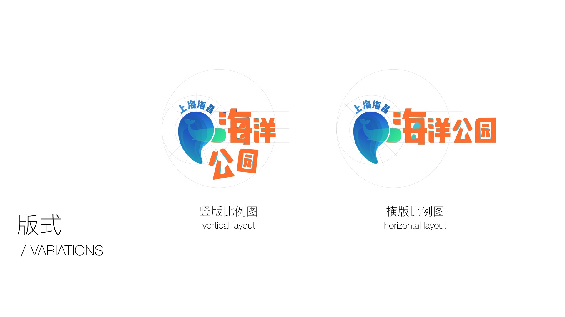
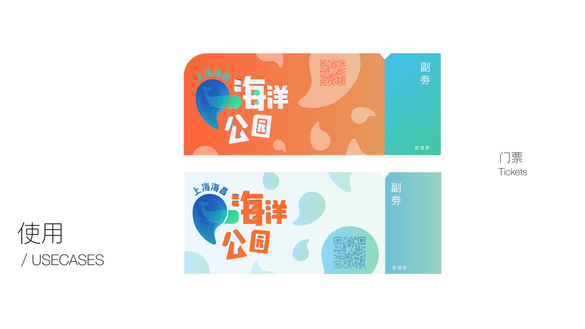
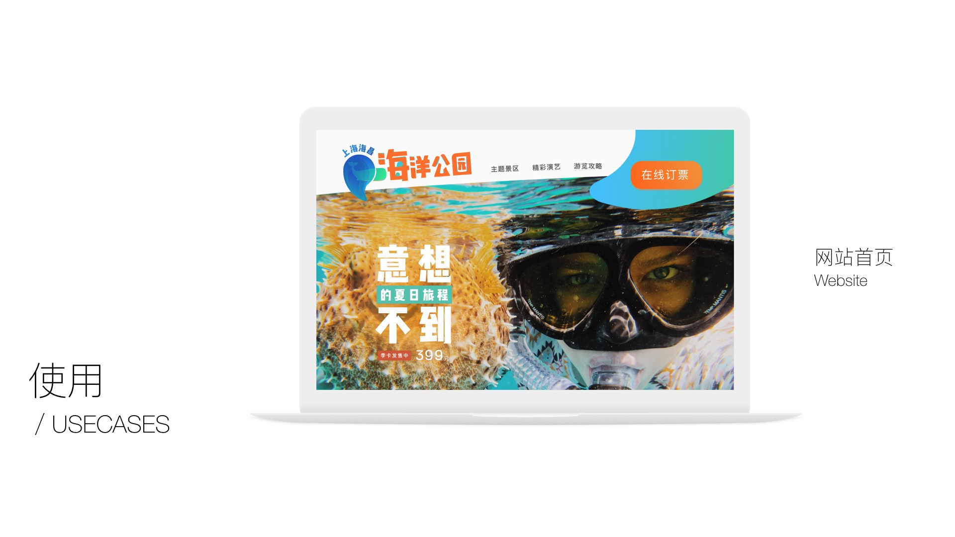
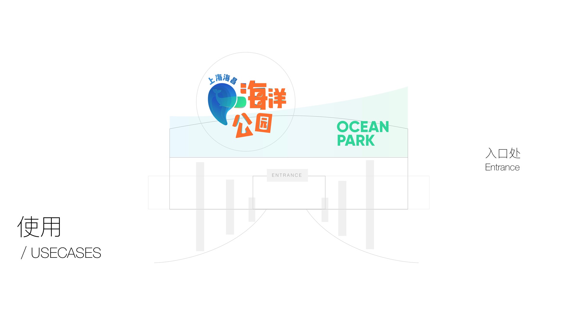
I prepared these for a client pitch for an aquarium in Shanghai. Unfortunately I did not make it :( Still thought it was a good exercise. The blue text is the company's name "shanghai haichang" and the orange text means "ocean park".
THE CONCEPT
The idea was pretty straight-forward: the apostrophe came from a stroke in the character "海"(means ocean) and also in the shape of a water drop symbolizing the aquarium. The whale silhouette was probably cheesy now looking at it. I spent a lot of time playing with composition to create depth and balance between the symbols and the characters.