Groupon Bucks Activation
SUMMARY
"Groupon Bucks" were reward credits users can spend on Groupon deals. One way users could get "Groupon Bucks" is by using our coupons to shop on-line at other stores such as Target. Since we earned referral commissions from these purchases, "Groupon Bucks" was an incentive. It was also an effective way to bring users back to Groupon - who often times ended up buying more. This project aimed to investigate and improve the not-so-great performance of version 1.
DATE
2018
Role
Product Designer
THE PROBLEM
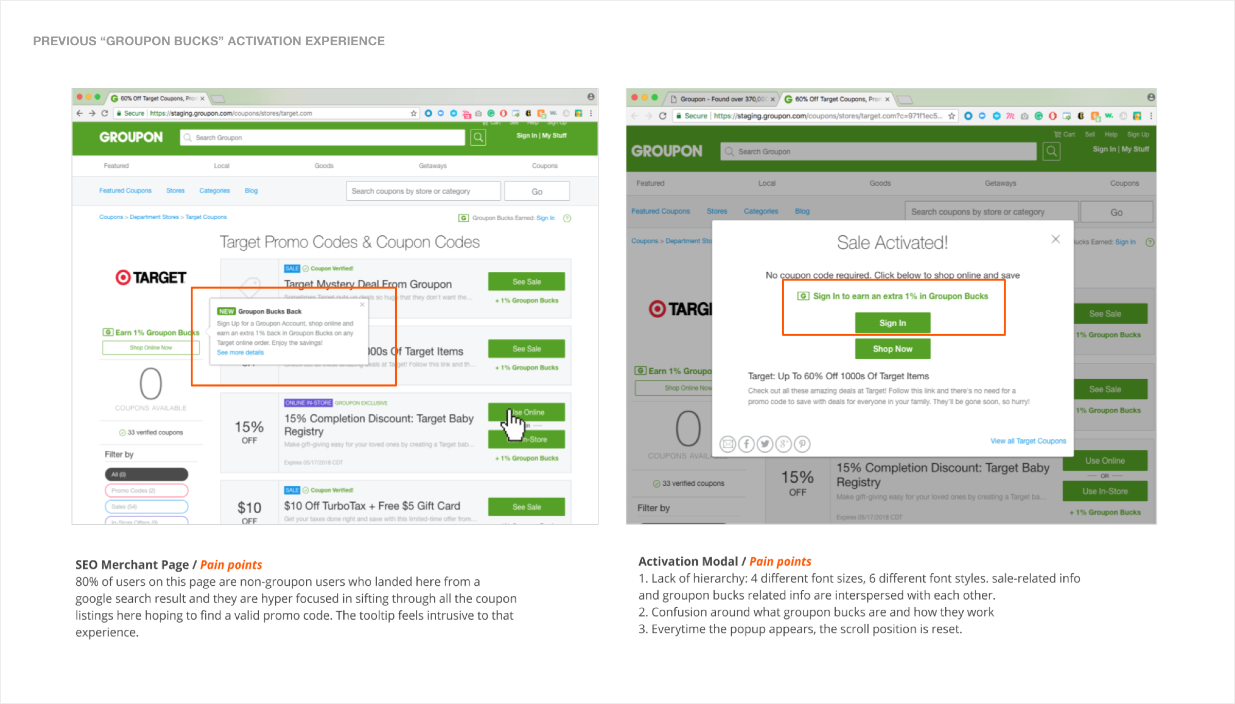
The previous feature demonstrated positive financials, but had room for improvement. Its user experience was confusing and cumbersome.
DESIGN EXPLORATIONS
My initial designs explored a range of possible alternatives. We decided to continue with the first approach for 2 main reasons: 1. For effective A/B test between the new/previous experience, keeping the "modal" format will limit the number of variables. 2. The "modal" format provides ample room to display offer details, terms & conditions.


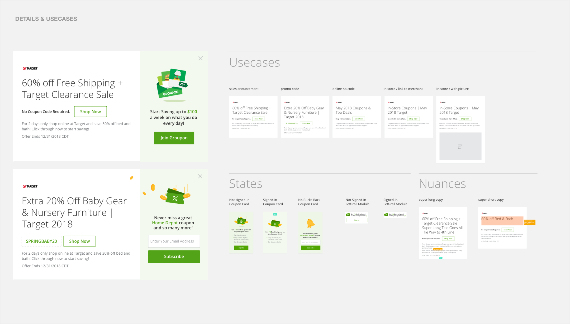
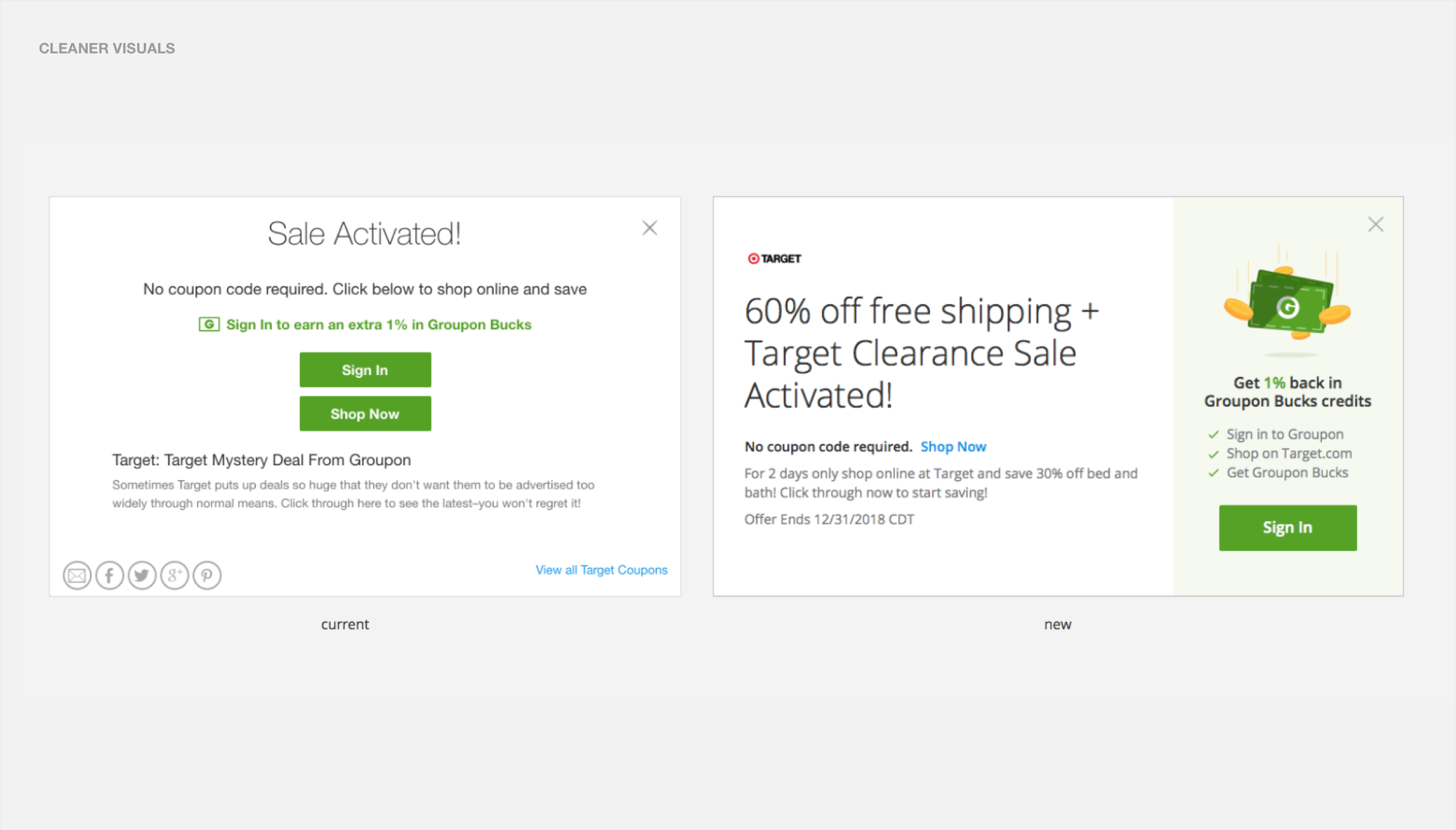
In this approach, I separated sale info and "Groupon Bucks" promo.
On the left, the large sale title, as the main visual anchor, reinforced user's intent. The store logo added a tad visual hook amongst inevitable text-heavy coupon details. On the right, I introduced a three-bullet educational unit, which outlines key details. We wanted to help users digest how this loyalty program works in a split second.
The biggest challenge here was to balance the prominence of the left/right side. We wanted to encourage users to sign-in without stopping their high-intent buy flow.
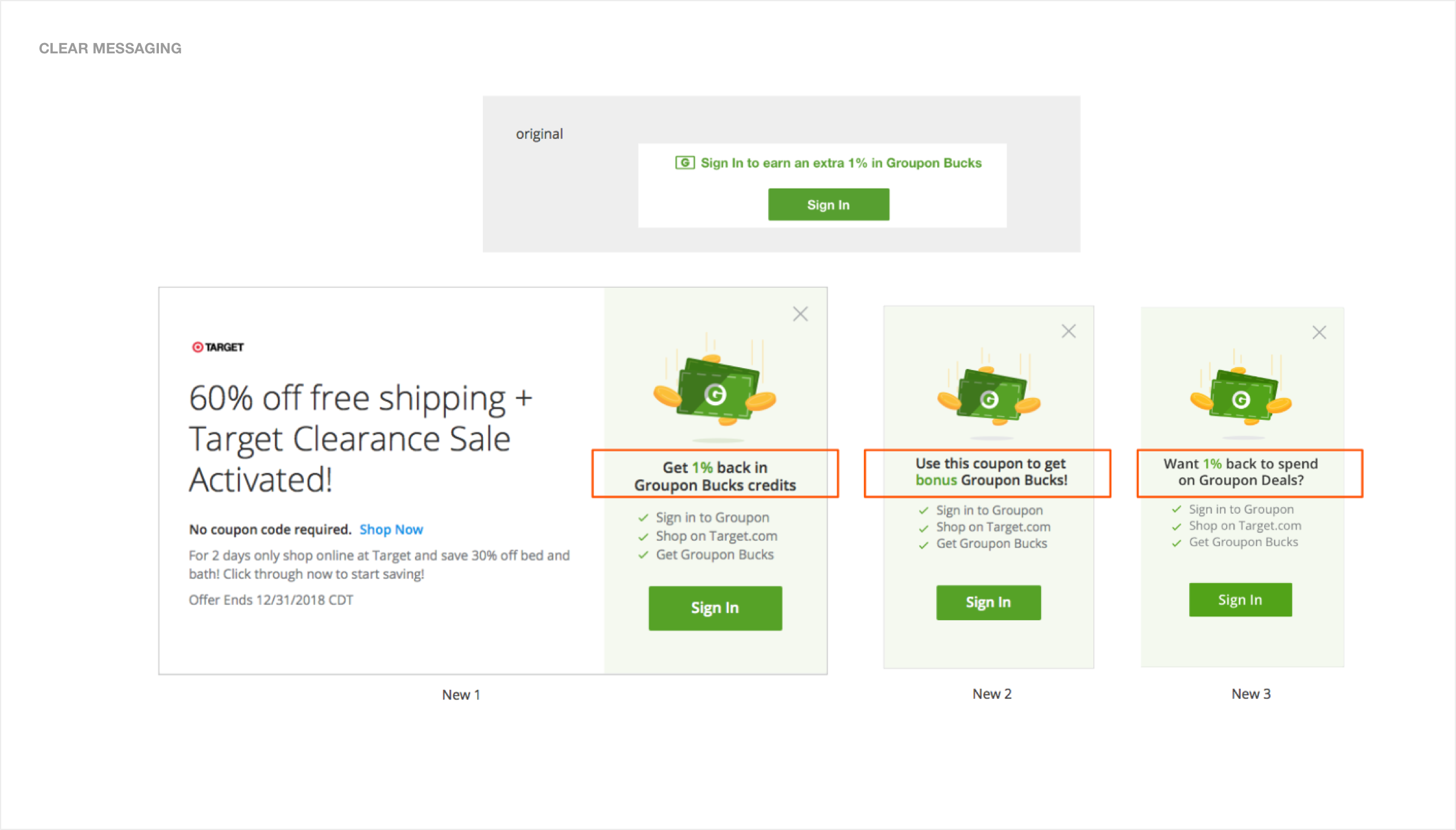
I worked with our UX content strategist to re-iterate the tagline. In the most concise way possible, each one hit a different note.
QUICK VALIDATIONS
Would users understand, and better yet, feel excited about saving money this way? How did we stack up against our competitors like Retailmenot?
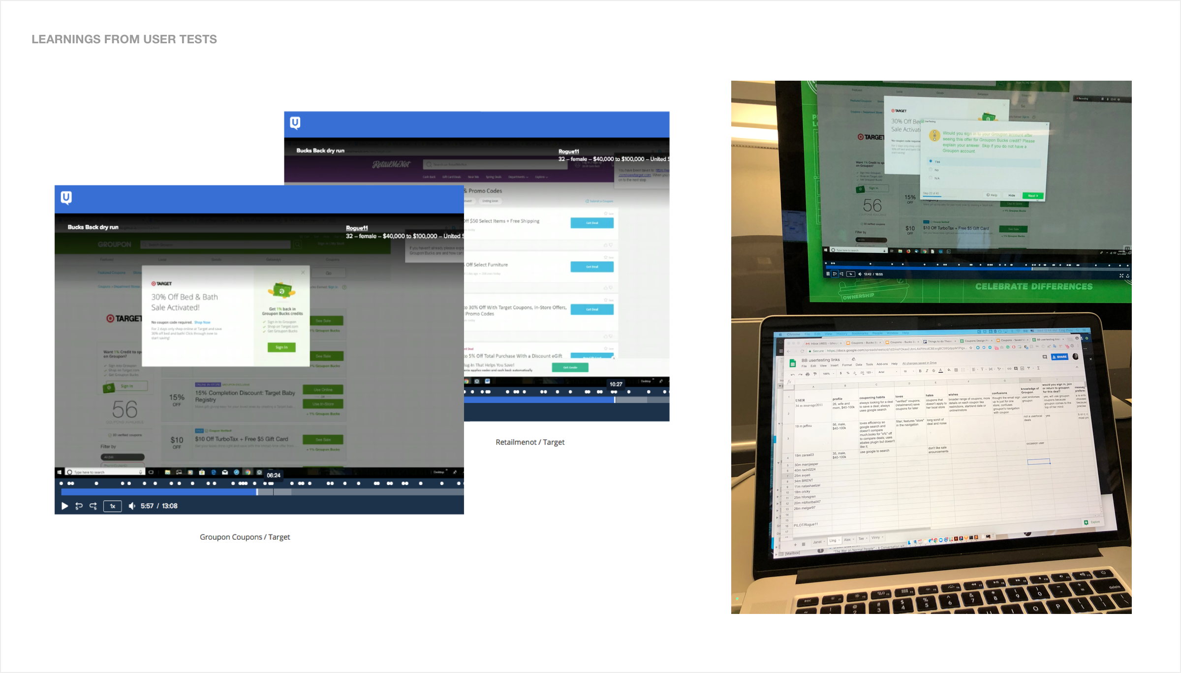
I created a prototype that emulates our current interaction pattern. It took users to a new tab with the modal while re-directing to the merchant's website in the old tab. This 99% fidelity prototype helped us capture accurate user responses.
In our 30-min user studies with 12 users, we asked each one to find a Target coupon using our prototype and Retailmentnot's website.
We also used this opportunity to listen to our users - from online couponing/money-saving habits, frustrations to tips and tricks.

FINAL SOLUTION
After validating our hypothesis, I developed a final design solution with a versatile system for usecases.